How to Make Your Web Pages Printer-Friendly With CSS

I am a freelance UK full-stack web developer with a few decades experience.
Few people print web pages. Most sites work well on mobile devices and the price of printer ink can make a billionaire wince. That said, there are occasions when printing is useful:
- tickets for travel or events
- route directions and timetables
- saving a page for reading later
- accessing information in areas with no connectivity
- accessing data in dangerous or dirty conditions
- creating output for person-to-person collaboration
- outputting draft content for written annotations
- receipts for bookkeeping
- providing content to those who have difficulties using a screen.
Even if you're not outputting to paper, it's often useful to print a page to a PDF document so it's available offline.
Unfortunately, printing can be a frustrating experience on many sites:
- text is too small, too large, or too light in color
- columns are too narrow, too wide, or overflow margins
- sections become cropped or disappear entirely
- unnecessary content such as icons, menus, and advertisements are output
- unnecessary backgrounds and images waste ink
- large blank spaces waste paper
- information is missing, such as link URLs
Some sites offer downloadable PDFs as an alternative but:
It's considerable development effort. You're publishing the same content twice so it's best considered for technical articles with complex illustrations.
Most publishers reduce this work by printing web pages to PDFs. The same layout problems can arise and it's largely pointless given modern browsers can save PDF files.
There's no need to create PDFs if you apply CSS print styles to your site. Ensuring all pages are printer-friendly can be a challenge but it's possible to improve your paper and PDF output with a few hours effort.
Adding Printer Stylesheets
The easiest way to start is to apply print CSS over your existing screen styles. In other words, use screen styles as a base but override them when necessary -- such as using a more suitable font size.
Add a new print media stylesheet after your existing screen styles:
<!-- default styles -->
<link rel="stylesheet" href="main.css" />

<!-- print style overrides -->
<link rel="stylesheet" media="print" href="print.css" />
Styles in print.css are applied in addition to main.css when printing the page.
You can also include print styles in existing CSS files using a @media query:
/* standard body styles */
body {
  font-size: 1em;
  color: white;
  background-color: black;
  margin: 2em;
}

/* print overrides */
@media print {

  body {
    font-size: 16px;
    color: black;
    background-color: white;
    margin: 0;
  }

}
If your screen styles require too many overrides, you can separate your screen and print styles so both start from the browser's defaults:
<!-- screen styles -->
<link rel="stylesheet" media="screen" href="main.css" />

<!-- print styles -->
<link rel="stylesheet" media="print" href="print.css" />
You can also apply screen-only styles with a @media query:
/* screen styles */
@media screen {

  body {
    font-size: 1em;
    color: white;
    background-color: black;
    margin: 2em;
  }

}

/* print styles */
@media print {

  body {
    font-size: 16px;
    color: black;
    background-color: white;
    margin: 0;
  }

}
How to Test Printer Styles
There's no need to kill trees and bankrupt yourself buying ink when testing printer output! Print emulation is available in browser DevTools (F12, Control + Shift + I or Command + Option + I on Mac OS).
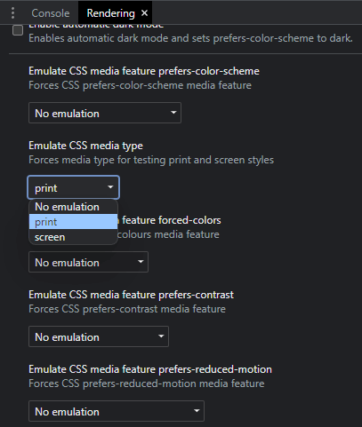
Chromium-based browsers such as Chrome, Edge, Opera, Vivaldi, and Brave provide a Rendering panel (click the 3-dot menu). Scroll down to Emulate CSS media type and choose Print:
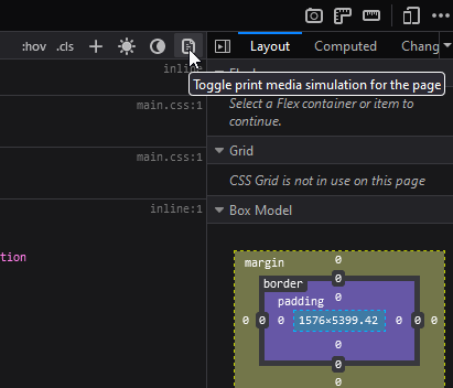
In Firefox, click the Toggle print media icon in the styles section of the Inspector panel:
The emulation is not perfect but it helps to style fonts, colors, and blocks. Pages and breaks are not emulated so your browser's Print Preview (Control/Command + P) is the most practical option. You can output a PDF if you need more detailed checks.
Hide Unnecessary Content
Start by removing any content which is unnecessary on a printed page. Use display: none; in your print CSS to remove and collapse headers, navigation menus, forms, video players, audio players, sidebars, advertising, and more:
/* print.css */
header, footer, nav, aside, form, video, audio .adslot {
  display: none;
}
Don't be afraid to use display: none !important; if necessary. CSS developers usually avoid !important because it can lead to specificity issues but applying it in print styles as a final override will not cause problems.
Simplify Your Layout
Modern browsers are good at printing grid and flexbox layouts but some designs will be more of a challenge than others. Unless you're attempting a complex magazine-like layout, it's easier to linearize the content so it works on all paper sizes:
/* print.css */
main, article, section {
  display: block;
  width: 100%;
}
You could apply CSS columns if this results in overly-long lines of text:
/* print.css */
main {
  column-width: 8cm;
  column-gap: 2cm;
}
Text will flow into columns when space allows. Two columns are shown on paper with at least 18cm of printable horizonal space. Text at the bottom of the left column on a page continues at top of the right column on the same page -- regardless of how may pages are output.
Apply Printer-Friendly Styling
You're usually printing dark text on white paper. Browsers often attempt to invert light on dark designs and hide background images but there's no harm explicitly adding overrides.
Consider also:
- using a serif font which can be easier to read on paper
- ensuring text sizes are large enough, and
- adopting real-world units such as
pt,cm,mmandinwhere appropriate.
/* print.css */
* {
  font-family: serif !important;
  font-size: 16pt !important;
  line-height: 1.5 !important;
  color: black !important;
  background-color: white !important;
  background-image: none !important;
}

main {
  margin: 8mm 0;
}
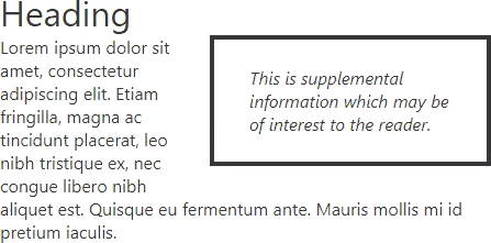
Solid blocks of background color also waste ink and make serif fonts difficult to read:
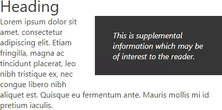
Consider using a border instead:
/* print.css */
blockquote {
  color: black;
  background-color: white;
  background-image: none;
  border: 3px solid black;
}
(The color and background properties are unnecessary if you've already set them in the all-selector * rule.)
Images such as charts remain part of your core content; do not hide them when printing. You can modify the styles of SVGs embedded directly into the HTML page:
<main>
  <svg xmlns="http://www.w3.org/2000/svg" viewBox="0 0 100 100">
    <rect x="10" y="10" width="80" height="80"></rect>
  </svg>
</main>
The print CSS can set more appropriate weights, colors, and dimensions:
/* print.css */
path, rect, circle, ellipse {
  stroke-width: 5pt;
  stroke: black;
  fill: none;
}

text {
  stroke-width: 0;
  stroke: none;
  fill: black;
}
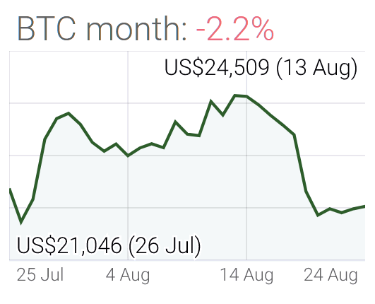
This is not possible when using an SVG or bitmap image (JPG, PNG, GIF, webp etc) in a standard HTML <img> tag:
<img src="chart-dark.png" class="chartdark" alt="chart" width="531" height="430" />
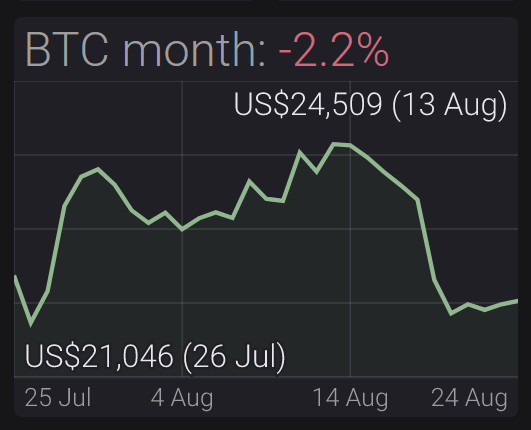
However, the CSS filter property can apply effects similar to those found in graphic applications such as Photoshop and GIMP. The following code:
- inverts all colors so blacks become white and whites become black (like an old photograph negative)
- uses
hue-rotateto put non-grey colors back to their original reds, greens, and blues, and - applies a little
brightnessandcontrastas necessary.
/* print.css */
.chartdark {
  filter:
    invert(100%)
    hue-rotate(180deg)
    brightness(105%)
    contrast(120%);
}
The result when printed looks better and uses considerably less ink:
Add Print-Only Content
You cannot click or swipe printed pages so styling links is not practical. However, you can append a link's URL to the content using a pseudo-element:
/* print.css */
a::after {
  content: " (" attr(href) ")";
}
The content of any attribute can be output in the same manner but it may be more practical to add HTML which is hidden until it's printed, e.g.
<p class="print">This page is printed from <code>site.com/page/</code></p>
The CSS:
/* screen styles */
@media screen {

  .print { display: none; }

}

/* print styles */
@media print {

  .print { display: block; }

}
The method could be extended to apply a watermark to every printed page:
<p class="watermark print">Copyright site.com</p>
Using position: fixed; and a little styling creates a centered watermark on every printed page:
/* print styles */
@media print {

  .watermark {
    position: fixed;
    font-family: sans-serif;
    font-size: 5vw;
    width: 100%;
    left: 50%;
    top: 50%;
    text-align: center;
    transform: translateX(-50%) translateY(-50%) rotate(-45deg)!important;
    transform-origin: 50% 50%;
    color: rgba(0,0,0,.2)!important;
    background-color: transparent !important;
  }

}
The result:

The user could remove this from the DOM using DevTools before printing but we'll discuss a way to address that issue below.
Set Page Dimensions
The @page at-rule can change the dimensions of page depending where it appears in the printed order. It's best to maximize the amount of content on each page but it may be necessary to apply margins for binding or annotation:
/* print.css */

/* target all pages */
@page {
  margin: 0cm;
}

/* target the first page */
@page:first {
  margin-top: 6cm;
}

/* target left, even-numbered pages */
@page:left {
  margin-right: 3cm;
}

/* target right, odd-numbered pages */
@page:right {
  margin-left: 3cm;
}
Control Page Breaks
Browsers normally apply reasonable page and column breaks but you may find headings at the bottom of the page or images split across two pages.
CSS permits page break control but the browser is limited by the dimensions of the page: it cannot always avoid or force a break. You should also be wary of over-using page breaks and wasting unnecessary paper.
The following properties are all print-specific so can they could be added to your screen stylesheet. I recommend keeping them print CSS to ensure they're with related properties and easier to maintain.
The break-after and break-before properties allows you to suggest where breaks should occur in relation to a specific element. Both accept the same values:
auto: the default — a break is permitted but not forcedavoid: avoid a break on the page or columnavoid-page: avoids a page breakavoid-column: avoids a column breakcolumn: force a column breakpage: force a page breakleft: force one or two page breaks so the next page is a left pageright: force one or two page breaks so the next page is a right page
For example, you could place every <h2> heading at the top of a new page:
/* print.css */
h2 {
  break-before: always;
}
or create a break after every <table>:
/* print.css */
table {
  break-after: always;
}
or avoid a page break immediately after a heading to ensure the following paragraph is on the same page:
h1, h2, h3, h4, h5, h6 {
  break-after: avoid;
}
The break-inside property controls whether a break can occur inside an element. Commonly supported values are:
auto: the default — a break is permitted but not forcedavoid: avoid a page or column breakavoid-page: avoid a page breakavoid-column: avoid a column break
Ideally, image elements should never be split:
/* print.css */
img, svg {
  break-inside: avoid;
}
A narrow <table> could wrap over columns but not pages:
/* print.css */
table {
  break-inside: avoid-page;
}
The widows property defines a minimum number of text lines to show in a block at the top of a page.
For example, presume a paragraph has five lines of text. If the browser wanted to make a page break after line four, a single line would appear at the top of the next page. If you declare the following CSS:
/* print.css */
p {
  widows: 3;
}
the browser would try to ensure that at least three lines carry across to the next page. If possible, it would create a break after the second line of text.
The orphans property is similar but it sets the minimum number of lines shown at the bottom of a page. Both properties are supported in all browsers except Firefox.
Finally, the box-decoration-break property defines how borders on an individual element are rendered when an inner page break occurs:
slice: splits the layout (the default). A top border is shown on one page while the bottom border is shown on the following page.clone: replicates the margin, padding, and borders. Both the top and bottom borders are shown on both pages.
Advanced Print-Layout Media Queries
CSS media queries are available to print as well as screen output. You could go wild and apply differing styles for paper widths using min-width values. However, switching between portrait and landscape styling will put your site beyond the competition:
/* print styles always applied */
@media print {

  main {
    display: flex;
  }

  img {
    height: auto;
  }

}

/* print styles applied to portrait pages */
@media print and (orientation: portrait) {

  main {
    flex-direction: column;
  }

  img {
    width: 100%;
  }

}

/* print styles applied to landscape pages */
@media print and (orientation: landscape) {

  main {
    flex-direction: row;
  }

  img {
    width: 50%;
  }

}
Advanced Print Control in JavaScript
It's not difficult to find your browser's Print option or press Control/Command + P but some users may require further guidance. You can trigger printing with the JavaScript method:
window.print();
You could therefore add any number of print buttons which trigger the printer dialog when clicked:
<button class="startprint">print this page</button>

<script type="module">
document.addEventListener('click', e => {
  if (e?.target?.classList.contains('startprint')) {
    window.print();
  }
});
</script>
You also want to ensure print buttons are not printed by hiding them in CSS:
@media print {

  .startprint {
    display: none;
  }

}
Browsers also offer two print-related events:
beforeprint: fired when the document is about to be printed or previewedafterprint: fired when the document has started printing or the preview is closed
These allow you to modify the document before and after printing. While print CSS is preferable, the events allow dynamic content to be added -- such as user credentials or the time of printing:
<script type="module">
let printMsg;

// add print-only message
window.addEventListener('beforeprint', () => {

  printMsg = printMsg || document.body.appendChild( document.createElement('p') );
  printMsg.textContent = `printed on ${ new Date() }`;

});

// remove print-only message
window.addEventListener('afterprint', () => {

  printMsg = printMsg && printMsg.remove();

});
</script>
Text such as the following will appear at the bottom of the last printed page:
printed on Wed Aug 24 2022 18:30:33 GMT+0100 (British Summer Time)
You could use this method to add a copyright message such as the watermark above. Users wouldn't be able to remove the text from the DOM before printing because it doesn't exist! They could edit or disable JavaScript but that's a more difficult proposition.
Conclusion
Creating printer-friendly web pages adds some complications and results will vary across sites, browsers, and devices. However, you can define print styles at any time, browser support is good, your code cannot break existing CSS, it shouldn't take long, and it can be fun.
It may not be at the top of your priority list, but a few print styles will help users and it adds a level of polish other sites rarely receive.