How to use web fonts in CSS

I am a freelance UK full-stack web developer with a few decades experience.
In the early days, designers were limited to popular system fonts such as Arial, Helvetica, Verdana, and Times New Roman. Reliable custom font use was only possible with image replacement or plugins such as Flash.
Basic support for web fonts was introduced in Internet Explorer 4.0 released in 1997. However, it took more than a decade for cross-browser technology to be implemented by the @font-face tag. The availability of new open source fonts also prevented legal issues from vendors who were reluctant to allow unrestricted use of commercial typefaces.
In this tutorial, we discuss various techniques and best practices for adding custom fonts to web pages. But first…

Do you really need a web font?
Just because you can add dozens of fonts to every page does not mean that you should!
- Designers recommend using fonts sparingly, with just one or two typefaces per document
- Custom fonts typically require a few hundred Kb. The more you add, the larger your page weight, and the worse your page performance. This can be especially problematic on mobile devices and slower networks
- The days of every site using standard OS fonts such as Helvetica or Times New Roman have long gone — there are fewer reasons not to use them
Operating system fonts come for free and can provide a noticeable performance boost. Each platform differs in the fonts it offers, but fallbacks can be specified as well as the generic font family names of serif, sans-serif, monospace, cursive, fantasy and system-ui, e.g.
body {
font-family: Arial, Helvetica, sans-serif;
}
Web apps may also feel more native if they use a standard system font. For example, the following stack implemented at GitHub.com targets system fonts available across Mac OS, iOS, Windows, Linux and Android platforms:
body {
font-family: -apple-system, BlinkMacSystemFont, "Segoe UI", Roboto, Helvetica, Arial, sans-serif, "Apple Color Emoji", "Segoe UI Emoji", "Segoe UI Symbol";
}
and a similar variation is used by Medium.com and the WordPress administration panels:
body {
font-family: -apple-system,BlinkMacSystemFont,"Segoe UI",Roboto,Oxygen-Sans,Ubuntu,Cantarell,"Helvetica Neue",sans-serif;
}
If a stack requires several declarations in a stylesheet, it may be practical to use a CSS preprocessor such as Sass:
$font-stack: "Segoe UI",Roboto,Ubuntu,sans-serif;
body {
font-family: $font-stack;
}
CSS custom properties:
:root {
font-stack: "Segoe UI",Roboto,Ubuntu,sans-serif;
}
body {
font-family: var( — font-stack);
}
or a @font-face declaration which references local fonts:
@font-face {
font-family: fontstack;
font-style: normal;
font-weight: 300;
src: local("Segoe UI"),local("Roboto"),local("Ubuntu");
}
body {
font-family: fontstack, sans-serif;
}
Using a web font repository
If a system typeface makes your marketing manager wince, there are several repositories offering a huge range of open source fonts which are served from a Content Delivery Network (CDN). Popular options include:
- Google Fonts: https://fonts.google.com/
- Font Library: https://fontlibrary.org/
- Adobe Edge: https://edgewebfonts.adobe.com/
Google Fonts is the most-used and provides searchable list, weight and style customization options, and load time estimation.

Google Fonts
To embed a font in a page, use the standard tag in the HTML head, e.g:
The font will be downloaded and processed in parallel with your own stylesheet.
Alternatively, a CSS @import can be used:
@import url('https://fonts.googleapis.com/css?family=Open+Sans');
but this blocks processing of further stylesheets until the font styles have been parsed.
The web font can then be set in any CSS declaration, e.g:
body {
font-family: "Open Sans", sans-serif;
}
Further optimizations can be made on the URL API such as requesting multiple families:
https://fonts.googleapis.com/css?family=Inconsolata|Droid+Sans
with differing weights and styles:
https://fonts.googleapis.com/css?family=Inconsolata:500,700
https://fonts.googleapis.com/css?family=Roboto:bolditalic
or limiting the font to known letters — perhaps for a logo or heading, e.g:
https://fonts.googleapis.com/css?family=Inconsolata&text=hello
Refer to Get Started with the Google Fonts API for more information.
Using your own font files
Any font file can be used in your web page but check that you have permission from the owner of the typeface. All modern browsers support WOFF format. WOFF2 offers typical compression savings of 30% but is not supported by Internet Explorer. For older or more obscure applications, TTF, EOT or SVG may be an option.
The Font Squirrel Webfont Generator provides a simple tool to upload one or more fonts, tweak settings, and download a kit containing the converted fonts and CSS code.
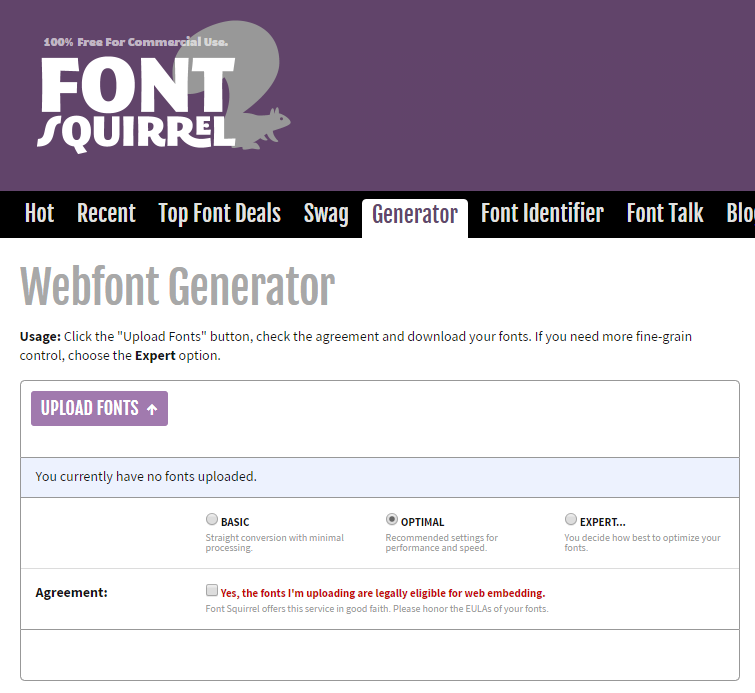
Font Squirrel Webfont Generator tool
By default, it provides a WOFF2 font, a WOFF fallback and the appropriate CSS @font-face settings, e.g:
@font-face {
font-family: 'mytypeface';
src: url('mytypeface-webfont.woff2') format('woff2'),
url('mytypeface-webfont.woff') format('woff');
font-weight: normal;
font-style: normal;
}
body {
font-family: mytypeface, serif;
}
FOUT and FOIT
A web font may take several seconds to download especially on a slower device or network. The browser can choose to:
- show a Flash of Unstyled Text (FOUT). The first available fallback is used immediately. It is replaced by the web font once it has loaded. This process is used by IE, Edge 18 and below, and older editions of Firefox and Opera
- show a Flash of Invisible Text (FOIT). No text is shown until the web font has loaded. This process is used in all modern browsers which typically wait 3 seconds before reverting to a fallback
It is possible to control some aspects of the browser’s font-rendering process.
Set a font-flash favorite with font-display
The font-display property allows you to define which process is used in Firefox, Safari and Chromium-based browsers. The options:
- auto: the browser’s default behaviour. This is the easiest option but may not provide the best reading experience
- block: effectively FOIT — the text may be invisible for up to three seconds. There is no font swap, but it can make a site feel slower because text is not immediately available
- swap: effectively FOUT — the first fallback is used until the web font is available. Text can be read without any delay, but the font swap effect can be jarring if not managed effectively
- fallback: a compromise between FOIT and FOUT — text is invisible for a short period (typically 100ms) then the first fallback is used until the web font is available. Although text is readable as the page load, the font swap could still be problematic
- optional: the same as fallback, except that no font swapping will occur. The web font will only be used if it is available within the initial period. The first page view is likely to show a fallback font while the web font is downloaded and cached. Subsequent page views will use the web font. This could be a reasonable option if the web font and fallback are similar but, in that case, is a web font actually necessary?
Example:
@font-face {
font-family: 'mytypeface';
src: url('mytypeface-webfont.woff2') format('woff2'),
url('mytypeface-webfont.woff') format('woff');
font-weight: normal;
font-style: normal;
font-display: swap;
}
Different fonts could use different settings. For example, body text could use swap (FOUT) so it can be read immediately while menus and heading text use block (FOIT).
Enforcing FOUT with JavaScript
The font-display property is likely to be undefined or auto when using typefaces from repositories such as Google Fonts (although changes to the API are being considered). In most browsers, text will be invisible for several seconds (FOIT).
To implement FOUT-like loading, there are several libraries such as the Typekit webfontloader which use JavaScript to control how fonts are loaded. Most follow the same process and can be replicated with a few lines of code. First, a system fallback is defined as the primary font in CSS:
body {
font-family: Georgia, serif;
}
JavaScript is then used to fetch the web font and append a new class (such as wt-active) to the HTML `` tag once it has downloaded:
(() => {
// load Google font
let font = document.createElement('link');
font.rel = 'stylesheet';
font.href = 'https://fonts.googleapis.com/css?family=Merriweather';
font.onload = () => document.body.classList.add('wf-active');
document.head.appendChild(font);
})();
A further CSS declaration then overrides the default fallback font with the web font when the `wt-active` class appears:
body.wf-active {
font-family: Merriweather;
}
Effective FOUT reflow
A flash of unstyled text can be jarring when the fallback and web fonts are significantly different and cause a noticeable layout reflow. A tool such as Font style matcher can help minimize the effect by setting appropriate weights, line heights and spacing for the fallback and/or web font.
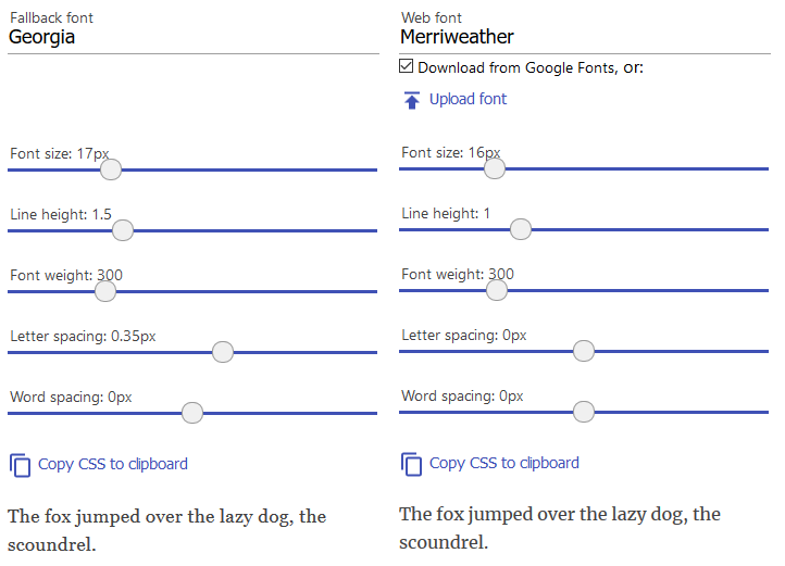
Font style matcher
The resulting replacement causes fewer problems when reading body text regardless of how long it takes to load the font:
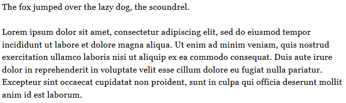
minimizing the font switch effect
Handling font weights and styles
Each font file has its own weight (boldness), style (italic slant), stretch, and variants. The browser will attempt its own interpolations if you make adjustments in CSS without loading an associated font. Rendering will be slower, fonts may look worse, readability could be affected, or widths could be dramatically different and break layouts, e.g:
/* load font with a weight of 300 */
@import url('https://fonts.googleapis.com/css?family=Open+Sans:300');
body {
font-family: "Open Sans", serif;
}
/* but use a weight of 600 - do not do this! */
strong {
font-weight: 600;
}
The solution is to load a separate font file for every weight and style you require then explicitly set all styles accordingly, e.g.
/* load font with weights of 300 and 600 */
@import url('https://fonts.googleapis.com/css?family=Open+Sans:300,600');
/* weight 300 for all elements */
* {
font-weight: 300;
}
body {
font-family: "Open Sans", serif;
}
/* weight 600 for bold elements */
h1, h2, h3, strong {
font-weight: 600;
}
However, loading separate font files for every variation of weight and style is rapidly becoming unnecessary…
Variable fonts
OpenType 1.8 introduced variable fonts in 2016. Rather than creating multiple files for each variation of the same typeface, variable fonts define minimum and maximum vector limits along an axis, e.g.

variable font width axis vector limits
Any font weight between these two extremes can now be interpolated. Depending on the font, you may be able to adjust aspects of the typeface including:
Weight
The thickness of the font can be set between 1 and 1000 using:
font-weight: 400;
/* or */
font-variation-settings: 'wght' 400;
Width
The font can be stretched to produce condensed or extended variations. 100% is normally considered the default with ranges above or below that value for narrower or wider widths accordingly:
font-stretch: 80%;
/* or */
font-variation-settings: 'wdth' 80;
Italic
The italic axis is either on or off because standard and italic characters can be different:
font-style: italic;
/* or */
font-variation-settings: 'ital' 1;
Slant
The slant — or oblique — differs from italic in that the letterforms are not changed but can vary on an axis typically between 0 and 20 degrees:
font-style: oblique 10deg;
/* or */
font-variation-settings: 'slnt' 10;
You are unlikely to find variable fonts in repositories until browser support becomes more widespread. Resource files can be discovered at sites including v-fonts.com, Axis-Praxis and Font Playground.
Variable font files can be loaded using @font-face with a woff2-variations format and the allowable ranges, e.g:
@font-face {
font-family: 'MyVariableFont';
src: 'myvariablefont.woff2' format('woff2-variations');
font-weight: 200 800;
font-stretch: 75% 125%;
font-style: oblique 0deg 20deg;
}
Specific styles can then be set in any selector with the multiple CSS properties:
p {
font-family: 'MyVariableFont';
font-weight: 300;
font-stretch: 100%;
font-style: oblique 0deg;
}
or the shorthand font-variation-settings property:
p {
font-family: 'MyVariableFont';
font-variation-settings: 'wght' 300, 'wdth' 100, 'slnt' 0;
}
Variable font support can be tested with a CSS @supports query, e.g:
p {
font-family: FallbackFont;
}
@supports (font-variation-settings: 'wght' 300) {
p {
font-family: 'MyVariableFont';
font-variation-settings: 'wght' 300, 'wdth' 100, 'slnt' 0;
}
}
This makes it possible to load standard single-style font files for older browsers and add further styles when variable fonts are supported. Unfortunately, most browsers will download all fonts which negates any performance benefit from a single variable font file.
Conclusion
Web fonts have revolutionized site typography during the past decade. Designers have fewer constraints and can implement typefaces which work on all mainstream devices and browsers.
However, font download weight, site performance, and managing the flash of unstyled or invisible text remain issues. A standard OS font should always be your first consideration.
Variable fonts are the future. These offer multiple variations, the potential for new typeface-based effects, cut page weight, and simplify development. They are an exciting development but be wary of limited browser support.
Plug: LogRocket, a DVR for web apps
LogRocket is a frontend logging tool that lets you replay problems as if they happened in your own browser. Instead of guessing why errors happen, or asking users for screenshots and log dumps, LogRocket lets you replay the session to quickly understand what went wrong. It works perfectly with any app, regardless of framework, and has plugins to log additional context from Redux, Vuex, and @ngrx/store.
In addition to logging Redux actions and state, LogRocket records console logs, JavaScript errors, stacktraces, network requests/responses with headers + bodies, browser metadata, and custom logs. It also instruments the DOM to record the HTML and CSS on the page, recreating pixel-perfect videos of even the most complex single page apps.