30 Ways to Improve Website Performance with CSS
Some simple style optimizations can improve your website performance.

I am a freelance UK full-stack web developer with a few decades experience.
According to the httparchive.org page weight report, CSS accounts for 7 HTTP requests and 70Kb of code on the average web page totalling 70 requests and 2MB. It's not the worst cause of woeful website performance (I'm looking at you, JavaScript), but there are specific CSS challenges:
CSS is render-blocking
Each
<link>and@importhalts other downloads while the browser downloads and parses the required CSS file.CSS can request other assets
CSS can reference images, videos, fonts and other CSS files which cause a cascade of further downloads.
CSS code grows over time
It can be difficult to identify unused styles and removing the wrong ones causes chaos. Developers take the easy route and add more properties to an ever-growing stylesheet. The larger your file, the longer the download and processing time.
CSS affects rendering
Browsers render the page in three phases: layout (element dimensions), paint (text, colors, borders, shadows, etc.), and composite (positioning). Some CSS properties trigger all three phases which can degrade performance.
The following 30 tips will help you optimize CSS to improve actual and perceived response times.
1. Use CSS performance analysis tools
Measuring is the only way to identify performance opportunities and assess gains. All browsers offer a DevTools panel which is typically opened from the More tools menu or the keyboard shortcuts Ctrl | Cmd + Shift + i or F12.
The Network panel is a good place to start and, following a refresh, it shows a waterfall chart of asset downloads:
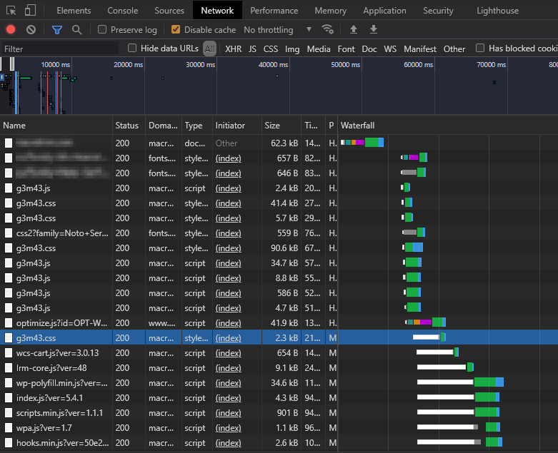
Longer bars highlight slow-loading or render-blocked assets (shown as white blocks above).
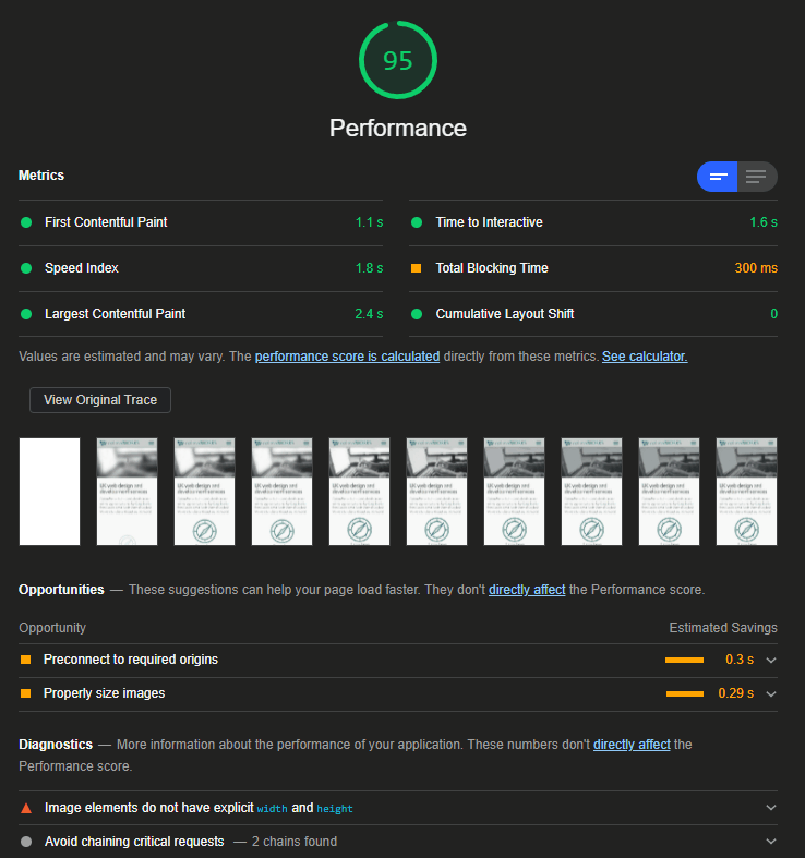
The Lighthouse panel, available in Chrome, Edge, Brave, Opera, and Vivaldi, can assess Core Web Vital metrics and make performance suggestions:
The same browsers also provide a Coverage panel to help locate unused CSS properties, as shown with a red border:
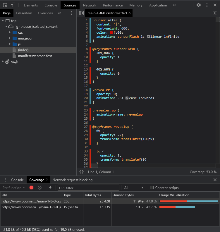
Be aware that unused style indicators:
reset when you refresh or navigate to a new page, and
calculate style usage over a period time. A required style may look unused because a widget isn't viewed or used in a particular way.
Most DevTools also offer Performance panels. These are most often used for JavaScript evaluation but they can also identify CPU and layout peaks when applying CSS.
Online performance tools can also report a range of CSS improvement factors:
2. Make quick indirect CSS improvements
You may be able to make performance improvements without touching any code:
Migrate to a better, faster web host or consider using a Content Delivery Network (CDN)
Enable GZIP or better compression
Active HTTP/2 or higher
Ensure browsers can cache your CSS by setting appropriate HTTP headers such as
Expires,Last-Modified, andETag.
3. Preload stylesheets
If your HTML requests commands,
The <link rel="preload"> tag allows you to CSS start downloads before they referenced. This may be practical when stylesheet references come after other assets or you have nested @import directives:
!DOCTYPE html>
<html lang="en">
<head>
<meta charset="UTF-8">
<title>Title</title>

<!-- preload CSS file -->
<link rel="preload" href="styles.css" as="style" />

<!-- more code -->

<!-- use preloaded styles -->
<link rel="stylesheet" href="styles.css" />
4. Remove unused styles and files
Remove any stylesheets you're not using. You may be able to identify page, widget, or framework code that's no longer in use. This task will be easier if you split your stylesheets into separate files with clear levels of responsibility and appropriate documentation.
The following tools can identify redundant code by analyzing your HTML and CSS:
HTML analysis alone is often not enough, but you can configure whitelisted styles such as those activated by JavaScript.
5. Remove CSS hacks and fallbacks
Older codebases may have a range of clunky IE hacks and fallbacks which attempt to fix layout problems or enable a modern CSS property. The last edition of the application was released a decade ago and is no longer supported. It's time to remove the code.
Even if you're unfortunate enough to have a large proportion of IE users, many CSS hacks make the browser slower.
6. Use OS fonts
Using an OS font can save hundreds of kilobytes and avoids issues such as a Flash of Unstyled Text (FOUT) or a Flash of Invisible Text (FOIT). Your users may not even notice. Of course, your designer will so...
7. Remove unnecessary fonts
Standard fonts require separate files for each weight and style. You may be able to remove those that are infrequently used.
Similarly, you're unlikely to require all the characters and glyphs within a font. You can generate a font subset using tools such as Font Squirrel or specify the characters you need in Google Fonts, e.g. load the Oswald font characters for "OpenRelay":
<link href="https://fonts.googleapis.com/css2?family=Oswald&text=OpenRlay" rel="stylesheet">
You could also consider variable fonts. These define a large variety of styles, weights, and italics using vector interpolation. The file is a little larger, but you require just one font rather than many.
8. Host font files locally
It's easy to reference a Google font but there's a performance cost for additional DNS look-ups, generating subsets, and tracking usage. Locally-hosted fonts can be noticeably faster to download and render.
The Web Open Font Format 2.0 (WOFF2) is the only file version you require. It's supported in all modern browsers and IE users can fallback to an OS font.
You should also define an appropriate font-display loading option in your CSS. The following options can provide a perceived performance boost:
swap: Use the first fallback OS font until the web font is available. Text is always readable but the Flash of Unstyled Text (FOUT) may be jarring if the two character sets have differing dimensions.fallback: A compromise between FOIT and FOUT. Text is invisible for 100ms. The web font is then used if it's available. If not, it reverts toswap.optional: The same asfallbackexcept no font swap occurs after the web font has downloaded. It should appear on the next page load.
9. Use HTML <link> instead of CSS @import
The @import at-rule allows you to load stylesheets within CSS:
/* main.css */
@import url("reset.css");
@import url("base.css");
@import url("grid.css");
This allows you to split stylesheets into smaller and more manageable stylesheets but each @import is render-blocking. The browser must download and parse every file in turn.
Using HTML <link> tags is more efficient since each stylesheet loads in parallel:
<link rel="stylesheet" href="reset.css">
<link rel="stylesheet" href="base.css">
<link rel="stylesheet" href="grid.css">
Alternatively...
10. Bundle and minify your stylesheets
HTTP/2 can serve multiple stylesheets better than HTTP/1.1, but a single file requires one header and can be gzipped and cached more efficiently. You can use any number of files during development but use a build step to bundle and minify into a single stylesheet. Tools including the Sass preprocessor or the PostCSS import plugin can do the hard work in single command.
11. Use modern CSS layouts
Older layout techniques such as float and, dare I say it, HTML <table> are clunky, difficult to manage, and require lots of code to manage spacing and media queries. If you still have them in your codebase, it's time to switch to:
CSS Columns. For newspaper-like text columns.
CSS Flexbox. For one-dimensional layouts which can optionally wrap to the next row. Ideal for menus, image galleries, cards, etc.
CSS Grid. For two-dimensional layouts with explicit rows and columns. Ideal for page layouts.
All are simpler to develop, use less code, render faster, and can adapt to different screen sizes without requiring media queries.
Very old browsers which don't support the properties show each element as a standard block. This results in a simpler and faster mobile-like linear layout. There's little reason to add fallbacks.
12. Replace images with CSS effects
When possible, use CSS code to generate graphics rather than referencing an image. Modern browsers offer gradients, patterned borders, rounded corners, shadows, filters, overlays, blend modes, masks, clipping, and pseudo-elements for sophisticated shapes.
A CSS effect will use considerably less bandwidth, is reusable, easier to modify, and can often be animated.
13. Never embed base64-enocded bitmaps
You can embed an image into CSS using base64 encoding which converts pixels into text characters:
.imgbackground {
  background-image: url('data:image/jpg;base64,0123456...');
}
The technique results in fewer HTTP requests, but it can harm CSS performance:
base64 strings are typically 30% larger than binary data
browsers require an extra step to decode the string, and
altering one pixel invalidates the whole CSS file so it must be re-downloaded.
Only consider base64 encoding if you have small images where the resulting string is not much longer than a URL.
14. Use SVGs when possible
Scalable Vector Graphics contain drawing directives such as plot a circle at this point with a radius of 50 units, a red fill, and a blue 3-unit border:
<svg xmlns="https://www.w3.org/2000/svg" viewBox="0 0 120 120">
  <circle cx="60" cy="60" r="50" stroke-width="3" stroke="#00f" fill="#ff0" />
<svg>
They are ideal for logos and diagrams, look good at any resolution, and should have a smaller file size than a bitmap.
Where pracitcal, you can inline SVGs directly into CSS code:
.svgbackground {
  background: url('data:image/svg+xml;utf8,<svg xmlns="https://www.w3.org/2000/svg" viewBox="0 0 120 120"><circle cx="60" cy="60" r="50" stroke-width="3" stroke="#00f" fill="#f0" /></svg>') center no-repeat;
}
This will increase the size of your stylesheet, but it can be useful for smaller reusable icons which must appear instantly.
15. Style SVGs with CSS
It's often more useful and efficient to embed SVG code directly into HTML, e.g.
<main>
  <svg xmlns="https://www.w3.org/2000/svg" viewBox="0 0 120 120">
    <circle cx="60" cy="60" r="50" stroke-width="3" stroke="#00f" fill="#ff0" />
  <svg>
</main>
This places the SVG into the DOM. The SVG's attributes have a low specificity and can be overridden in CSS:
/* change to green and black */
circle {
  stroke-width: 10px;
  stroke: #000;
  fill: #0f0;
}
You can:
remove SVG styling attributes from your HTML
use the same image with different styles for different sections or pages, and
animate any CSS properties.
16. Be wary of CSS frameworks
CSS frameworks are useful when you start web development. They provide a set of attractive styles so you can quickly become productive. The downsides?...
Frameworks can contain a significant volume of code but you're probably using a small proportion of the available styles. Where possible, check you're including the features you require and no more.
It can be difficult to override framework styles when they're not quite what you need. The result is two sets of styles when only one would have been necessary.
17. Be wary of preprocessor code generation
CSS preprocessors such as Sass benefit CSS development by providing language constructs such as variables, loops, functions, and mixins. That said, always check your generated code to ensure it's as concise as you would write yourself. In particular, deeply-nested structures can result in overly complex selectors which bulk up your stylesheets.
18. Simplify your selectors
Modern browsers have no trouble parsing long selectors but reducing complexity will reduce file sizes, improve performance, and make your code easier to maintain.
You should also consider the new :is, :where, and :has selectors which can transform CSS selectors like this:
article section.primary:not(:first-child) h1,
article section.primary:not(:first-child) h2,
article section.primary:not(:first-child) p,
article section.secondary:not(:first-child) h1,
article section.secondary:not(:first-child) h2,
article section.secondary:not(:first-child) p {
  color: red;
}
into a single concise line:
article section:not(:first-child):where(.primary, .secondary) :where(h1, h2, p) {
  color: red;
}
19. Avoid expensive properties
Some CSS properties require more processing than others. Add this code to your stylesheet to see how janky scrolling becomes!
*, ::before, ::after {
  box-shadow: 3px 5px 5px rgba(0,0,0,0.3);
}
The following properties trigger CPU-intensive paint calculations:
position: fixedborder-radiusbox-shadowtext-shadowopacitytransformfilterbackdrop-filterbackground-blend-mode
That's not to say you shouldn't use them, but be cautious when applying the properties to lots of elements.
20. Use CSS transitions and animations
CSS transitions and animations will be smoother than JavaScript-powered effects which alter the same properties. However, it's best to avoid animating properties that trigger a re-layout such as dimensions (width, height, padding, border) or the position (top, bottom, left, right, margin). These can cause the whole page to re-layout on every animation frame.
Efficient properties to animate include:
opacityfilter: blur, contrast, shadow, etc.transform: translate (move), scale, rotate etc.
Browsers can use the hardware-accelerated GPU to render these effects in their own layer so it only affects the final composite rendering stage.
You may be able to improve the performance of other animated properties by taking the element out of the page flow with position: absolute.
21. Use will-change when necessary
The will-change property warns the browser that an element will animate in a specific way so it can make optimizations in advance:
.animatedelement {
  will-change: transform, opacity;
}
You can set any number of comma-separated values.
will-change should be used as a last resort to fix specific performance problems. You should not to apply it to too many elements or start the animation immediately on page load. Give the browser a little time to make optimizations.
22. Handle the HTTP Save-Data Header
The HTTP Save-Data header indicates the user has requested reduced data. Browsers may label this option "lite" or "turbo" mode and, when it's enabled, a Save-Data header is sent with every browser request:
GET /main.css HTTP/2.0
Host: mysite.com
Save-Data: on
A server can detect the header and respond accordingly. For example, it could serve a simpler CSS file with a linear layout which uses an OS font, block colors, and fewer images.
The server must return the following header on modified requests to ensure the lightweight CSS file is not reused when the user deactivates Save-Data:
Vary: Accept-Encoding, Save-Data
Client-side JavaScript can also detect the Save-Data option. The following code adds a fullUX class to the <html> element when Save-Data is not enabled:
if ('connection' in navigator && !navigator.connection.saveData) {
  document.documentElement.classList.add('fullUX');
}
The stylesheet can then apply appropriate styles without any server interaction:
/* no hero image by default */
header {
  background-color: #ceb;
  background-image: none;
}

/* hero image when Save-Data is not enabled */
.fullUX header {
  background-image: url('bigimg.jpg');
}
The prefers-reduced-data media query offers a CSS-only alternative, although this is not supported in any browser yet:
/* no hero image by default */
header {
  background-color: #ceb;
  background-image: none;
}

/* hero image when no Save-Data */
@media (prefers-reduced-data: no-preference) {
  header {
    background-image: url('bigimg.jpg');
  }
}
23. Consider critical inlined CSS
Tools such as Lighthouse may recommend you "inline critical CSS" or "reduce render-blocking style sheets." by:
Identifying essential styles used by elements above the fold which are visible as the page loads.
Inlining that critical CSS into a
<style>tag in your<head>.Loading the remaining CSS asynchronously to avoid render blocking.
The following example loads the remaining CSS as a "print" stylesheet which the browser loads asynchronously at a lower priority. The onload code switches it back to a standard stylesheet for all media after it's downloaded. The <noscript> ensures it still loads if JavaScript is not enabled:
<head>

<!-- critical styles -->
<style>
  body { font-family: sans-serif; color: #111; }
</style>

<!-- load remaining styles -->
<link rel="stylesheet" href="main.css" media="print" onload="this.media='all'">

<noscript>
  <link rel="stylesheet" href="main.css">
</noscript>

<head>
The technique noticeably improves performance and could benefit sites or single-page apps with consistent interfaces. Larger sites can be more of a challenge:
It's impossible to identify the fold -- every device is different.
Sites with different page layouts require different critical CSS.
The technique only benefits the user's first page load. Subsequent page loads can use the cached stylesheet so inline CSS is not necessary and degrades performance.
Consider critical CSS if you have a small site, can reliably automate the build process, or have a single-page app.
24. Create device-targeted stylesheets
A single (built) stylesheet that contains code for all devices is practical for most sites. However, if your codebase is large or the mobile and desktop designs are considerably different, you could create device-specific stylesheets, e.g.
<!-- core styles for all devices -->
<link rel="stylesheet" href="core.css">

<!-- served to screens less than 400px wide -->
<link rel="stylesheet" media="(max-width: 399px)" href="mobile.css">

<!-- served to screens 400px or wider -->
<link rel="stylesheet" media="(min-width: 400px)" href="desktop.css">
25. Consider CSS Containment
CSS containment improves performance by allowing you to identify isolated subtrees of a page. The browser can then optimize the render process of specific DOM content blocks.
The contain property supports one or more of the following values in a space-separated list:
none: no containment (the default)layout: isolate the element from the rest of the page: its content will not affect the layout of other elementspaint: clip the element to a specific size without any visible overflowsize: the element's inline and block dimensions are independent of the content - there is no need to calcuate the size of child elementsinline-size: similar tosize, but applies to inline dimensions only.
Two special values are also available:
strict: apply all containment rules exceptnonecontent: applylayoutandpaint
Consider a page with a long <ul> list set to contain: strict;. When you change the content of any child <li>, the browser will not recalculate the size or position of that item, other items in the list, or any other elements on the page. Rendering is faster.
26. Try progressive rendering
Progressive rendering is a technique which defines separate stylesheets for each page and/or component. This will be of most benefit to large sites with a significant quantity of CSS where pages have differing designs or are constructed from a range of components.
There's no need to download a single large stylesheet on the first page load which would contain CSS for components you're not using.
A change to one component's styles does not affect other cached files.
You could adopt native web components or reference smaller CSS files immediately before a component appears in your HTML:
<body>
  <!-- core styles -->
  <link rel="stylesheet" href="core.css" />

  <!-- header -->
  <link rel="stylesheet" href="header.css" />
  <header>header content</header>

  <!-- article -->
  <link rel="stylesheet" href="article.css" />
  <main>

    <h1>title</h1>

    <!-- widget -->
    <link rel="stylesheet" href="widget.css" />
    <div class="widget">widget content</div>

  </main>

  <!-- footer -->
  <link rel="stylesheet" href="footer.css" />
  <footer>footer content</footer>

</body>
Most browsers render HTML while it downloads. Every stylesheet <link> is render-blocking but each file should be no more than a few kilobytes.
Older browsers may show a blank page until all CSS has loaded but the overall impact should be no worse than a single large render-blocking stylesheet.
27. Adopt web components
Native browser web components provide a way to create encapsulated, single-responsibility, custom functionality. In other words, you can create your own HTML tags, such as <hello-world> which is compatible with every framework.
JavaScript frameworks introduced the concepts but their components are never truly separate from other CSS or JavaScript. Native components provide a Shadow DOM which isolates the element so styling and functionality cannot leak in or out. The advantages:
By default, the CSS within a component has responsibility for its styling. It's downloaded and cached only when that component is used.
Component CSS can be more concise than page CSS because it does not need complex or placement-specific selectors.
Components can still expose shadow :part elements so limited external styling is possible.
28. Use good-practice development techniques
Good-practice techniques evolve, expire, and differ from developer to developer but solid approaches include:
Organise your CSS into smaller files with individual responsibilities, e.g. header, footer, form elements, tables, menus, etc.
Use linting tools and browser DevTools to ensure you set valid properties and values.
Automate your build process to construct a single stylesheet and auto-refresh using a tool such as Browsersync.
Adopt a mobile first approach. The default styles create a simpler, linear, mobile-like layout. Media queries and intrinsic grid layouts then apply more sophisticated desktop designs when room permits.
Test your styles thoroughly in mobile and desktop browsers. At the very least, use:
desktop: Firefox, Chromium (Chrome, Edge, Brave, Opera, or Vivaldi), and Safari
mobile: Chrome on Android and Safari on iOS.
Document your code. You won't remember what you did in a month -- how would another developer cope! A style guide with example components is ideal.
29. Embrace the cascade
Those new to CSS often attempt to work around the global namespace and style every component separately. CSS-in-JS frameworks often create random class names at build time so component styles cannot conflict.
Ultimately, it's better to work with CSS cascade than against it. For example, you can set default fonts, colors, sizes, borders etc. which are universally applied then override them when necessary. It results in less duplication and shorter, better-performing stylesheets.
30. Learn to love CSS
A little knowledge goes a long way. A few lines of modern CSS can replace and improve on effects which required complicated JavaScript a decade ago. The more CSS you know, the less code you need to write.
Admittedly, CSS is easy to learn but difficult to master. No one expects you to understand hundreds of properties but it's worth stepping through the code when you next find a solution on Stack Overflow or ChatGPT. A solid grasp of CSS basics can revolutionize your workflow, enhance your apps, and noticeably improve performance.